
This post has been authored by Aakrit Vaish, Co-Founder & CEO of Haptik
Change is the one constant in business, as it is in life. At Haptik, we know that perhaps better than anyone. After all, you don’t go from being a B2C focused Mumbai-based startup to one of the world’s largest providers of Enterprise Conversational AI solutions without shaking a few things up!
You might have noticed another change that we’ve recently made. It is a small change in comparison to the many we’ve gone through in our epochal seven-year long journey. But it is nonetheless a significant one – symbolic of how far we’ve come, and where we’re going.
I am referring of course to Haptik’s brand-new logo – the centerpiece of our refreshed brand identity and revamped website.
The decision to alter something that has been a constant at Haptik since its inception was not one we made lightly. There are a few reasons why we felt that this was the right time to make this change. But before I delve into that, let’s take a quick trip down memory lane and the story behind the original Haptik logo…
Lending a Helping Hand
Back in 2013, Haptik started as a direct-to-consumer personal assistant app – at first, handled solely by human agents, and later automated by Conversational AI. The basic idea was that the Haptik app would help people get things done. And so, it followed naturally that our logo should resemble the proverbial ‘helping hand’.
As people went about their days overwhelmed by both routine and special tasks, Haptik would essentially raise its hand to say “I’m here to help”.
The Haptik hand was indeed a very colorful one, and the multiple colors too served a purpose – to symbolize how the app could help users with a wide range of tasks. Taken together, the hand and the colors were meant to say “I’m here to help, and I can help with a lot of things”.
The bright colors, in addition to being pleasing to the eye, were also meant to symbolize positivity and optimism – reflecting our confidence in the ability of the Haptik app to accomplish the many tasks that it would be asked to perform.
Even as we made the transition from a B2C app to a B2B solutions provider for large brands, the logo remained constant, as we now extended a helping hand to our enterprise partners, and their customers.
So, why the change?
A lot has changed since we first made the pivot from B2C to B2B. We’re now one of the world’s leading providers of Intelligent Virtual Assistant solutions for enterprise – with a global presence that, thus far, spans India, North America, Southeast Asia, and the Middle East. In line with our expanded scope and scale, we decided that the time had come to refresh our brand.
Of course, in redesigning the Haptik logo, we did not want to throw the baby out with the bathwater. The core essence of the original logo, the notion that “I’m here to help with a lot of things”, would of course remain. But one key change we wanted to convey was a new focus on depth rather than breadth. Unlike our B2C app, which dealt with a very wide range of use cases, our B2B solutions focus on comprehensively solving specific business problems end-to-end that can generate exponential ROI for our partners.
And while we will always strive to retain the dynamism and agility of a startup, we wanted to change the colors to reflect a more mature identity. As an enterprise solutions provider, the tasks that our Conversational AI handles – namely Customer Care and Commerce – are of a far more critical nature than the kind of routine day-to-day tasks that we handled as a B2C app; and the new logo needed to underscore the seriousness of our work.
The New Haptik Logo
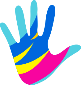
As you can see, there is a lot that is still the same with the new Haptik logo.
The logo still represents the ‘helping hand’ that we offer our partners and their customers. It still has multiple colors, to signify the fact that our virtual assistants can carry out a variety of tasks across several domains.
What has changed are the colors of the logo, each of which symbolizes a specific characteristic of who are as a company and a team:
Blue: A color that represents, among other things, integrity, trust, loyalty and intelligence. Its inclusion here speaks to our ceaseless commitment to drive customer success using our technology and expertise.
Pink: A color that represents compassion and playfulness. Its inclusion here reflects our status as a young, friendly and socially responsible organization.
Yellow: A color that represents happiness, energy and originality. Its inclusion here represents the dynamism and creativity of our team, as we put our heads together to develop innovative next-gen Conversational AI solutions.
From a certain point of view, it is still fundamentally the same logo, much like how Haptik is still fundamentally on the same mission – to transform the way people get things done by being at the forefront of the paradigm shift from clicks to conversations. But the scale and scope of our ambition, and the resources and experience that we bring to bear, have grown exponentially over the past seven years, and it is our hope that the new identity is befitting a rising global player in the new and rapidly evolving Conversational AI space.
Here’s to new beginnings, new wins, and of course, new conversations!


source on Google